Catherine Mullen, PhD

PhD Candidate, Department of Foklore and Ethnomusicology, Indiana University
Figure 4: Archival Growth Stacked Bar Graph
Archival growth, as depicted in the following stacked graph, shows cumulative month-by-month and year-by-year data of how many tags per popularity category were built up in the archive since 2007. Each tag type (bands, venues, industry professionals, and DJs) was divided into four popularity categories to convey which tags were most and least popular.
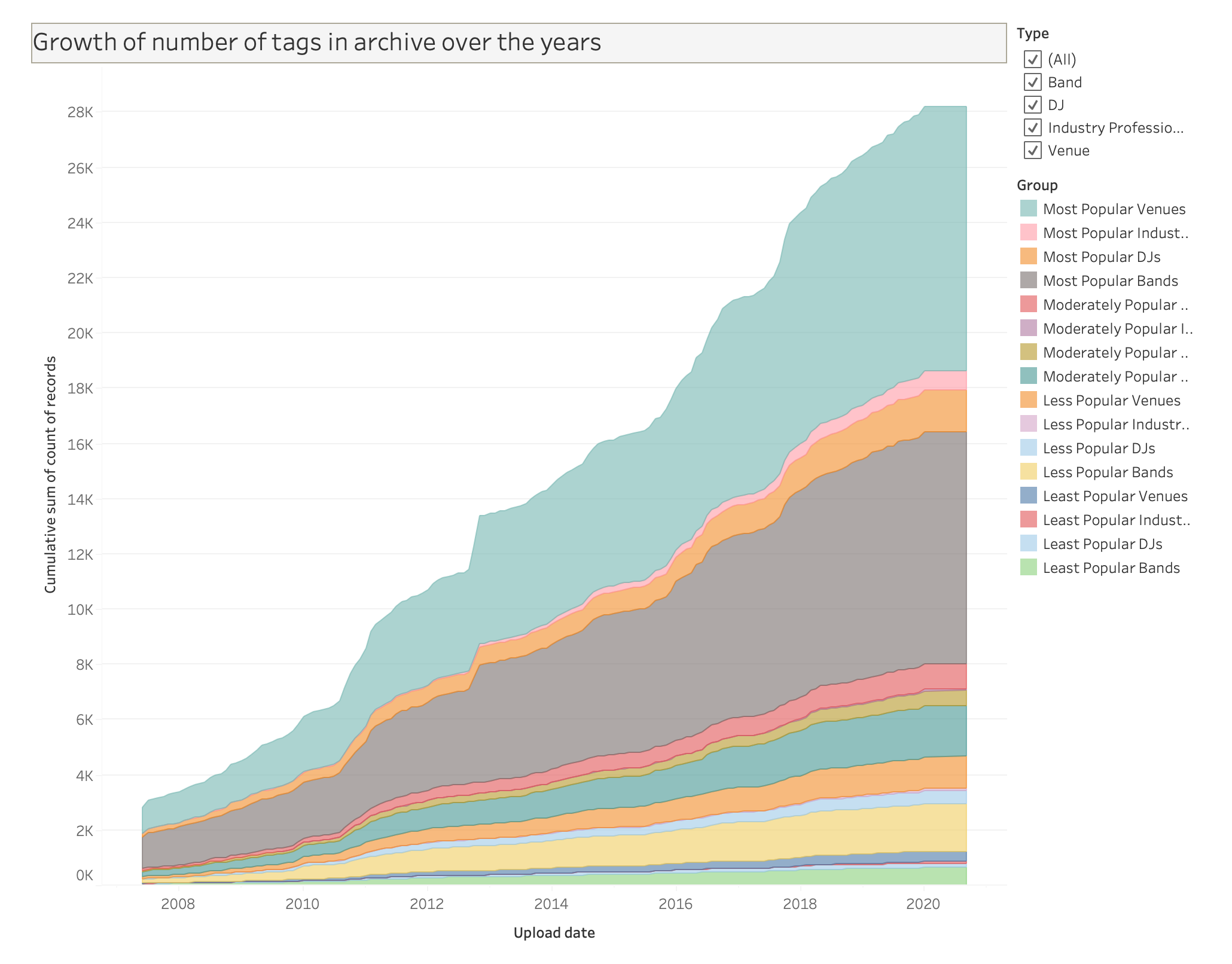
The width of each band shows the expansion of each group over time, to a point in 2020 where the database reached over 28,000 applied tags on the 18,135 artifacts in the archive at the time. Similar to the bubble chart, this stacked graph represents the relative proportion of popularity between tag types, recognizing those categories at any given point in time in the archive’s history. Archival growth does not necessarily make an argument for any distinct point about how popularity works, but instead shows how more popular tags generally accumulate and expand the number of associated artifacts over time, offering a perspective on archiving as a continuous process rather than a journey toward a fixed goal and stopping point in collection.
The following video walkthrough talks more about how to understand and navigate this archival growth graph.